
JavaScript: Discover Different Visualization Tools - Part 1
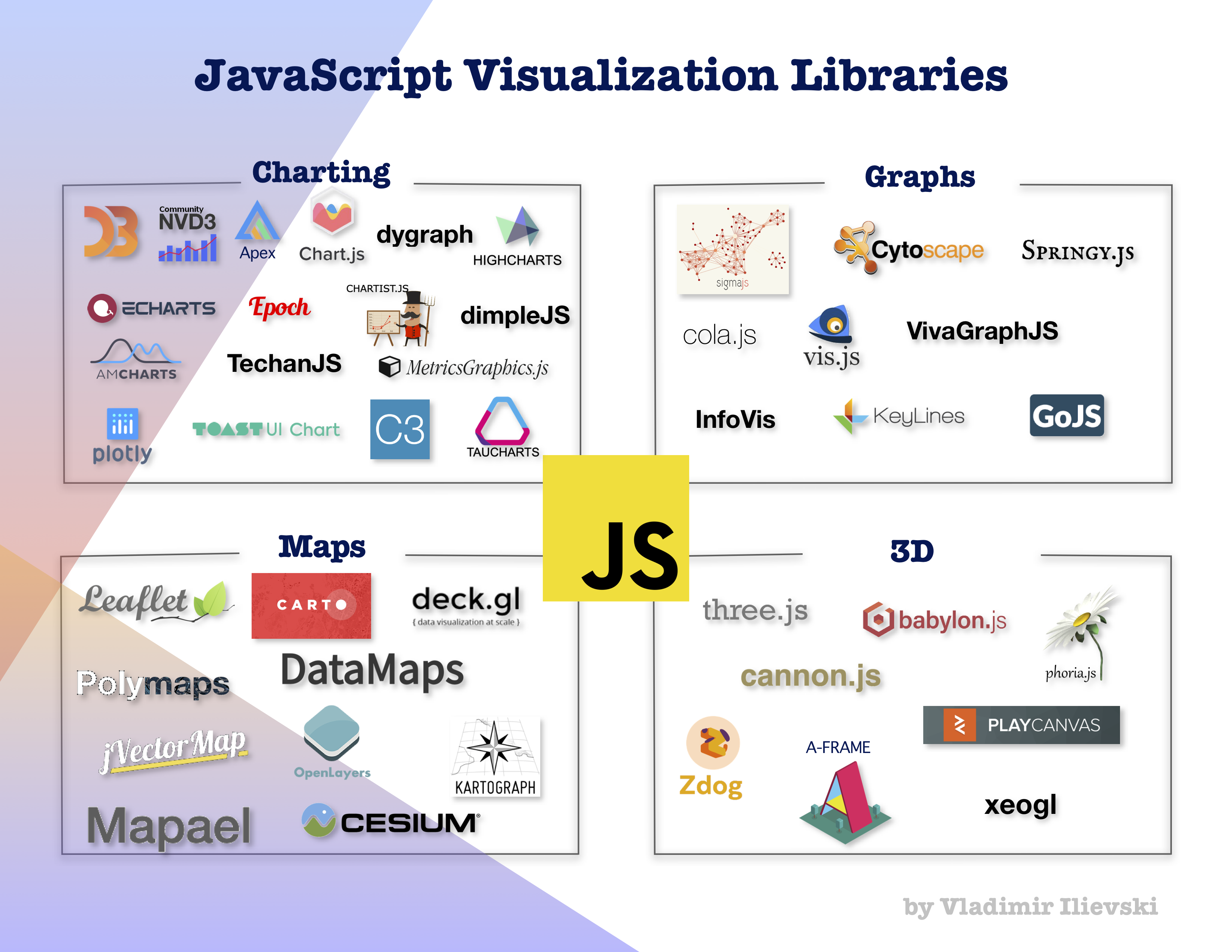
In the following series of blog posts, we make a recension of different JavaScript visualization libraries divided by their main functionality. We cover the following visualization categories :
- Charting: producing the common DataViz charts. For instance line, bar and area charts;
- Graphs: for plotting, manipulating and analyzing graph-based data;
- Maps: for representing data that has geographical features and
- 3D: creating three-dimensional charts as well as animations.
The goal is to show the advantages and disadvantages of each framework. This is quite important to know when searching what JavaScript visualization toolkit to use. We can see a nice landscape in the image above of some of the available options among these categories. In this blog post, we will only analyze the charting data visualization tools with hands-on experience for some of them.
Data
In all coding demos, we use the life expectancy dataset. This dataset was originally downloaded from Our World In Data analysis on life expectancy around the globe. The dataset consists of the life expectancy of every country as well as continents in the world through the years. We re-structure the data for the needs of our demos using this Python notebook.
Charting Tools
There are plenty of tools for charting. That gives us an opportunity and flexibility to choose one that well suits our needs. In the top-left corner of the image above, we see some of the popular charting JavaScript tools. This list is not exhaustive of course, there are many other libraries not included here.
More or less, all these tools enable the developers to easily pick one and quickly reproduce the most common and essential charts. We will more thoroughly analyze as well as give a coding example for NVD3, Plotly JS, and ApexCharts JS.
NVD3: À-propos
NVD3 is an open-source library and it is based on D3. Its aim is to bring the power of D3 while removing all unnecessary details and make the chart reproduction as smooth as possible. With its simple look, it can easily serve in the financial and more scientific sectors.
Popularity and maintainability
The open-source GitHub repository is quite popular with 7000 stars and 2200 forks. Officially, the library is used in 2700 other repositories. Besides the active contributors, the library is additionally maintained and supported by a company named Novus. That might be one more indication that the library is actively developed.
Although the main GitHub repository is quite popular there is no development activity in the repository for a long time. The development is moved to another not so popular repository, in order to make it compatible with version 4 of D3.
Palette of charts
NVD3 provides a decent amount of easily reproducible charts. On the official page of examples, we can see that it provides single and multi-line charts, scatter and bubble charts as well as discrete, grouped and stacked bar charts. On top of this, it provides a stacked area, pie and bullet charts.
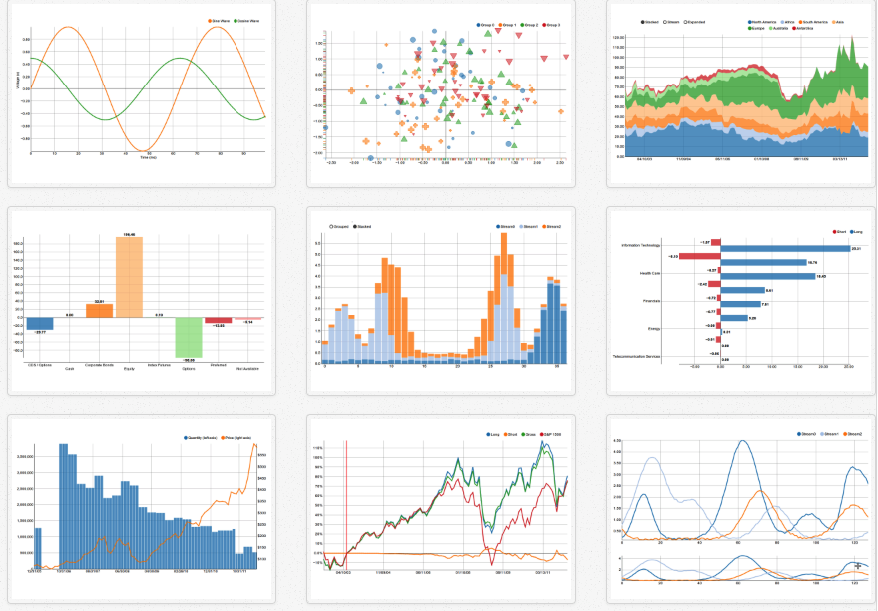 Figure 1: NVD3 chart gallery.
Demo
To show the capabilities of NVD3 we make a multiline plot using our life expectancy dataset. The data for every line must be formatted in the following format in order to be consumed by the tool:

where the key is the name of the line to appear in the plot and values is a list of objects where each object contains two values x and y, denoting each (x, y) pair to appear in the plot for that line.
First, we have to load the data. For this reason, as in every D3 application, we define the plotting logic inside the callback function of the d3.json method:

After the successful data loading, from the set of charts, we select an interactive line chart with the following code:

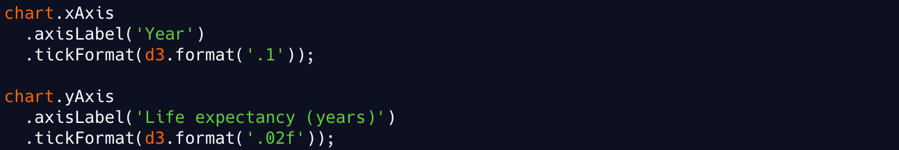
We restrict the values on the y-axis to be between 0 and 80. Then we set the labels and the ticks of the x and y-axis:
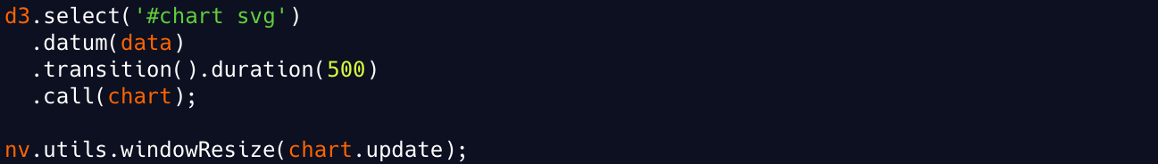
In the end, we only associate the loaded data to the defined line chart and set it to gradually draw in half a second (500 milliseconds):
Finally, the chart is depicted in the image below. You can try it on your own here.
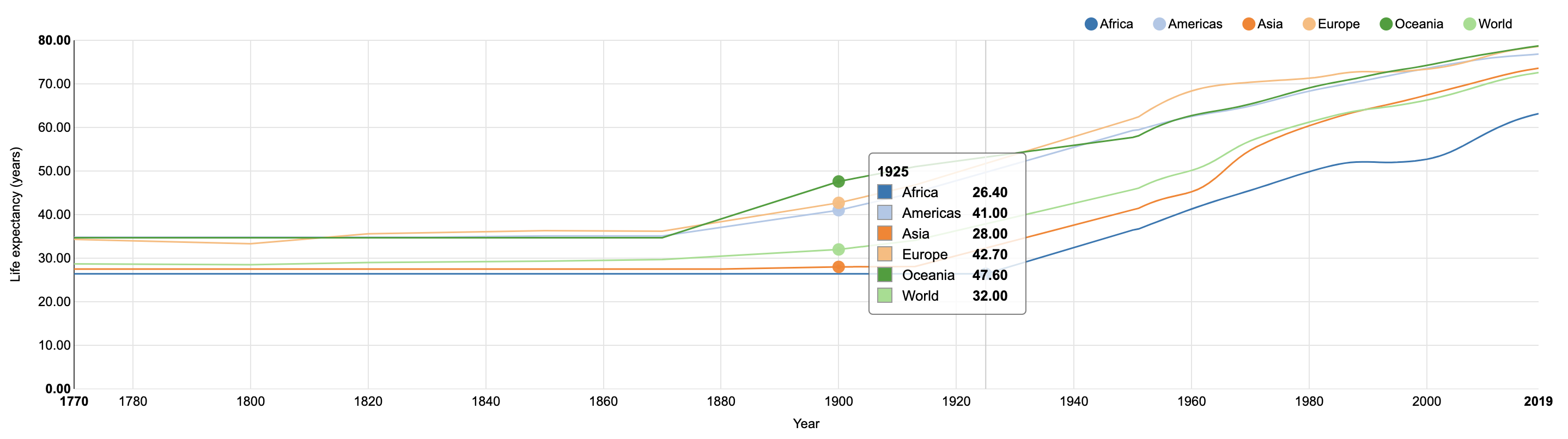 Figure 2: NVD3 Multi-line chart for the life expectancy data. Try it
here.
Figure 2: NVD3 Multi-line chart for the life expectancy data. Try it
here.
Last words
As we can see, it is quite easy and straightforward to produce a line chart using NVD3. The colors of each line are automatically generated. On top of this, the chart is interactive, showing the current values for each line in a box as we slide through it.
The legend is by default displayed in the right top corner and allows us to select what lines to display on the grid. One nice feature is, by clicking one item in the legend, we can disable the associated line. Moreover, by double-clicking the item, we select only that particular line. If we double-click again the same item, we enable all lines.
However, it is not possible by default to select a subset of values and zoom over them. This is very useful when we have many values on the x-axis and multiple lines that might vary over different regions.
Plotly JS: À-propos
Plotly JS is a popular open-source JavaScript library built on top of D3. The aim is to provide organizations with a powerful tool to build analytics apps in order to propagate the message of the data more efficiently. It has a simple and neat UI that can serve many purposes: building data dashboards, presenting scientific results and data, developing web and mobile applications.
Popularity and maintainability
The official GitHub repo is very popular with more than 11000 stars and 1300 forks. The development is quite active with every day commits and fixes. Moreover, the codebase is used in another 3700 repositories.
Apart from this, Plotly as a company is quite successful with a lot of funding, partners, clients, and monthly active users. All of this is a guarantee for the quality and freshness of the codebase.
Palette of charts
This library covers a wide range of charts, counting more than 40 different types of charts, all listed on the official examples page. First of all, there are some basic charts like line, bar and pie charts, as well as the, scatter plots. On top of this, we have the basic statistical charts like box plots, histograms and error bars. This list of more scientific charts is augmented with contour plots, heatmaps and radar, and polar charts.
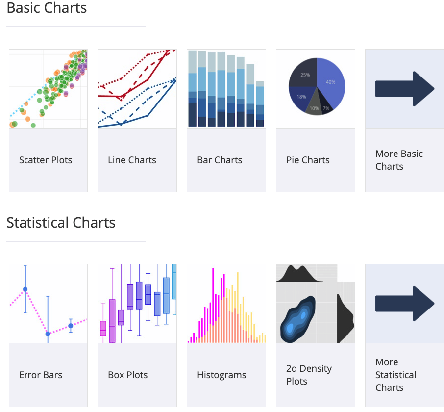 Figure 3: Plotly JS chart gallery.
There is support for plotting financial data. In this sector, we have a waterfall, funnel, bullet and candlestick charts. Moreover, Plotly JS provides some mapping charts for geo-based data. Last but not least, there are 3D charts and animations.
Demo
To demonstrate the capabilities of Plotly JS we make a bar plot using our life expectancy dataset. For each region over the years we plot one bar. We have to structure the data stored in a JSON file in the following format:
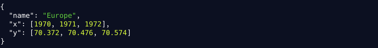
where the value inside the variable name is assigned to a particular bar and appears in the legend. The lists x and y as their name implies, contain the values the plot is relating on the x and y-axis respectively.
As previously seen, we have to successfully load the data and define the chart inside a callback function:

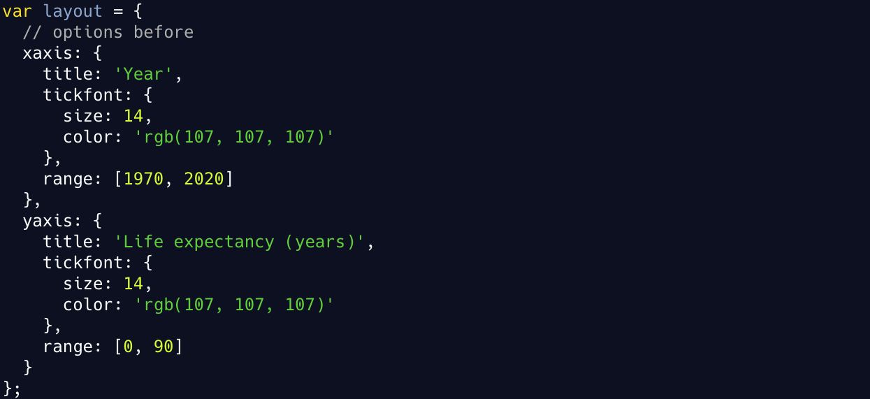
After the successful data loading, we create a JavaScript object named layout and inside we set the bar plot options. First, we can set the title and specify that there will be a group of bars with a certain gap between them:

Using the same object, we can easily set the x and y-axis options. Thus, we set the title, the tick options as well as the range of values for each axis:
The resulting bar chart is shown in the image below. The interactive web version of the plot can be found here.
 Figure 4: Plotly bar chart for the life expectancy data. Try it
here.
Figure 4: Plotly bar chart for the life expectancy data. Try it
here.
Last words
The charts generated with Plotly JS include many features. Firstly, they are interactive, showing the values associated with their label in a box as we move through the plot. Furthermore, the legend is interactive allowing us to select what bar plots to keep active. As an example, we can select only one bar and disable the rest.
One powerful feature is the toolbar that appears on top of the plot. It has many useful functionalities allowing us to easily manipulate the plot. For instance, we can download the plot as an image, zoom over it and select a subset of values on each axis to have a better look at them.
ApexCharts JS: À-propos
ApexCharts JS is an open-source library for interactive charts. Its main goal is to provide web developers a way to create and integrate into their web applications a large variety of charts in a straightforward manner. It has an interesting UI with specific bright colors providing a unique experience.
Popularity and maintainability
The GitHub repository containing the full development is well maintained. It is very well documented with tones of examples and clarifications. It has 8400 stars and it is used in another 4800 repositories, which is a good indicator that it is attractive. However, the number of forks is relatively low compared to the other popular libraries, only 447.
One additional factor is the collaboration of ApexCharts with FusionCharts, another provider of web and mobile visualization utilities. This additionally enhances the support and diversity of the available charts.
Palette of charts
ApexCharts JS contains a group of simple and easy-to-produce charts and more advanced charts. In the simple charts, we can find the standard line, area and bar charts as well as the mix between them. Furthermore, in this group of simple charts, there are the candlestick, bubble and scatter plots. Finally, we have a heatmap, pie, and radialbar.
 Figure 5: ApexCharts JS chart gallery.
In the more advanced types of charts, one can find the Chord and Sankey diagrams used for representing flows. In addition, there are Funnel, Pyramid and Sunburst charts. There are also many advanced statistical charts. A reference to all charts can be found here.
Demo
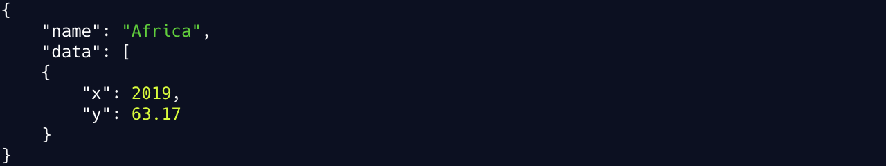
To test ApexCharts JS we create a multiline chart on top of our life expectancy data set. The data must be stored in a JSON file using the following format:
As usual, we must load the data from a JSON data file and upon the successful loading to define the chart in a callback function. For instance, we load and define the chart in the following function:

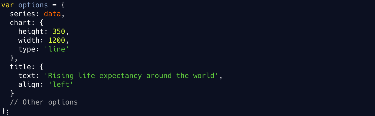
Then, we create an object named options and inside we define the multi-line chart components. We can start by defining the data to plot, the title, and some basic chart properties:
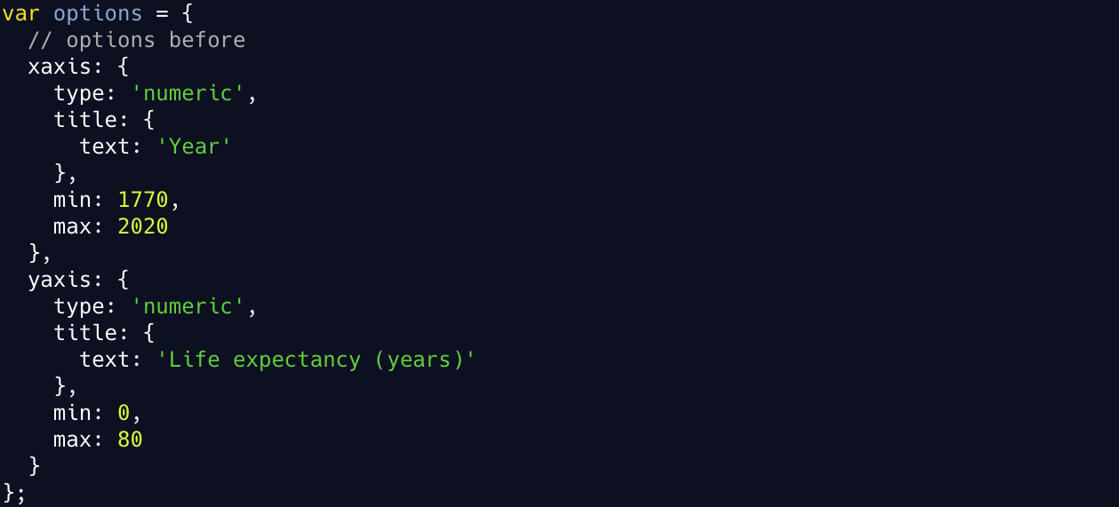
Finally, in the same object we can specify the x and y-axis details like the data type, the range of values and the title:
In the end, the line chart will look like the one presented in Figure 6 below. There is an interactive web version to play with it, which can be found here.
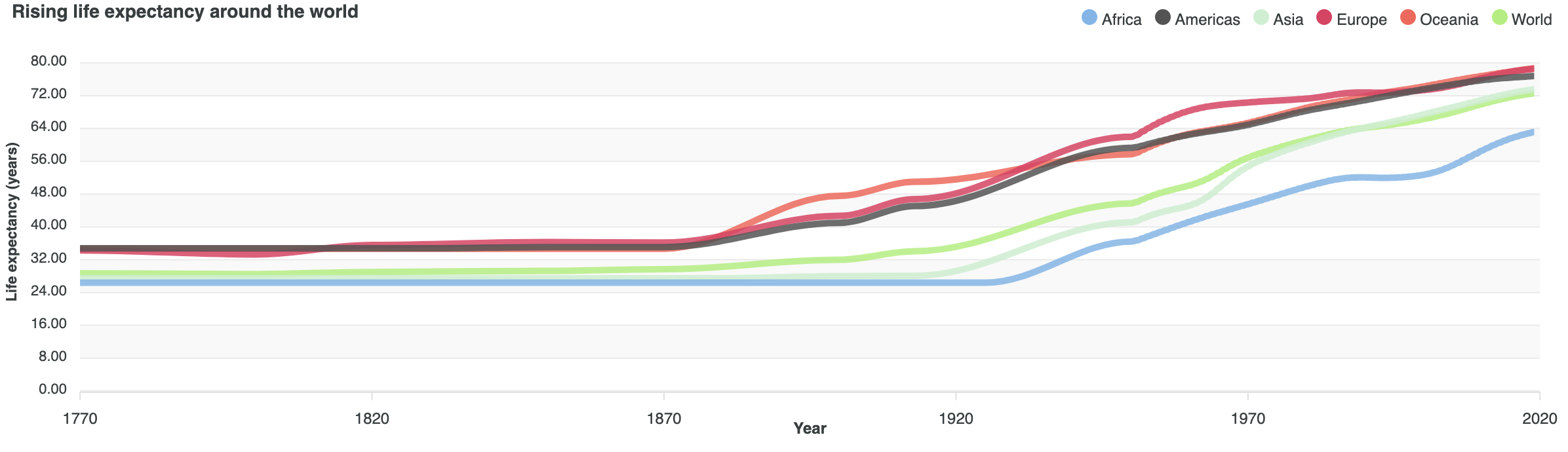 Figure 6: ApexCharts JS multi-line chart for the life expectancy data. Try it
here.
Figure 6: ApexCharts JS multi-line chart for the life expectancy data. Try it
here.
Last words
Similarly, as the other tools, it is also quite simple to produce charts using the ApexCharts JS tool. All charts are interactive with a possibility to zoom over a subset of values for a better analysis. However, once we select a range of values, there is no way to restart the selection and get back in the previous state.
The legend is interactive as well. We can disable and then enable again a certain line by clicking on the legend item associated with it. Moreover, only by hovering the mouse pointer over one of the legend items, the line associated with that item stands out while all other lines get transparent.
Summary
In this blog post, we had a more thorough overview of the charting JavaScript libraries. In general, we differentiate 4 types of JavaScript visualization libraries depending on their functionality: charting, graphs, maps, and 3D.
Out of the many charting libraries, we make a hands-on demonstration with NVD3, Plotly JS and ApexCharts JS using the life expectancy data set. We also give an overview of what these tools provide and how reliable they are.
If you liked what you just saw, it would be really helpful to subscribe to the mailing list below. You will not get spammed that's a promise! You will get updates for the newest blog posts and visualizations from time to time.
The full code to run all examples as well as the data set and the scripts to transform it can be found here. For more information please follow me on Twitter.
Leave a comment