Convergence of T-distribution to Normal Distribution. Visualized!
Disclaimer: This visualization guide was in big part written by ChatGPT
The Normal distribution and the Student’s T-distribution are commonly and interchangably used in statistical analysis. The Normal distribution is a continuous probability distribution that is symmetrical about the mean.
The Student’s T-distribution (or simply t-distribution) is a probability distribution that is used when the sample size is small and the population standard deviation is unknown. It is used to estimate the mean of a normally distributed populations. The t-distribution distribution is characterized by the parameter \(\nu\) which denotes the degrees of freedom. As this parameter increases, the t-distribution converges to the normal distribution.
In this blog post, we will visually demonstrate how the Student’s T-distribution converges to the normal distribution as the degrees of freedom increase.
We will use the matplotlib.animation module from the Matplotlib Animation API in Python.
Student’s T-distribution
The t-distribution is a family of distributions that is used to describe the distribution of the sample mean when the sample size is small and the population standard deviation is unknown.
The degree of freedom \(\nu\) is an important parameter in the t-distribution and determines the shape of the distribution. As the degrees of freedom increase, the shape of the t-distribution approaches that of the normal distribution.
Normal Distribution
The normal distribution is a continuous probability distribution that is symmetrical about the mean. The mean, standard deviation, and skewness are the important parameters in the normal distribution.
The mean is the center of the distribution and the standard deviation is a measure of the spread of the data. The normal distribution is widely used in statistical analysis and has many useful properties.
Visualizing the Convergence
To demonstrate the convergence of the Student’s T-distribution to the normal distribution, we will use the matplotlib.animation module in Python.
The matplotlib.animation module provides the tools necessary to create animations in Python. In this demonstration, we will create an animation that shows how the
Student’s T-distribution with different degrees of freedom converges to the normal distribution as the degrees of freedom increase.
First we import all required dependencies:
1
2
3
4
import numpy as np
import matplotlib.pyplot as plt
from matplotlib.animation import FuncAnimation
from scipy.stats import norm, t
Then we define the main logic:
1
2
3
4
5
6
7
8
9
10
11
12
13
14
15
16
17
18
19
20
21
22
23
24
25
26
27
28
29
30
31
# Creating a figure and axis
fig, ax = plt.subplots()

# Defining the degrees of freedom for the Student's T-distribution
df = np.linspace(1, 30, 30)

# Defining the x-axis values
x = np.linspace(-4, 4, 100)

# Set the labels
ax.set_xlabel("$x$", fontsize=16)
ax.set_ylabel("$P(x)$", fontsize=16)

# Creating a line object
line1, = ax.plot(x, t.pdf(x, df[0]), linestyle='-', lw=2, color="#960019", label="Student\'s T-distribution")
line2, = ax.plot(x, norm.pdf(x), linestyle='--', lw=2, color="#2CBDFE", label='Normal Distribution')

# Setting the axis limits
ax.set_xlim(-4, 4)
ax.set_ylim(0, 0.5)

# Defining the update function for the animation
def update(num):
    line1.set_data(x, t.pdf(x, df[num]))
    ax.set_title('Degrees of Freedom: {}'.format(df[num]))
    ax.text(1.5, -0.07, "by Vladimir Ilievski x ChatGPT", ha="left", va="bottom", fontsize=10, fontfamily="Verdana")
    return line1, line2,

# Creating the animation object
ani = FuncAnimation(fig, update, frames=range(0, 30), repeat=True)
ani.save("student_to_gaussian_animation.gif", writer="pillow")
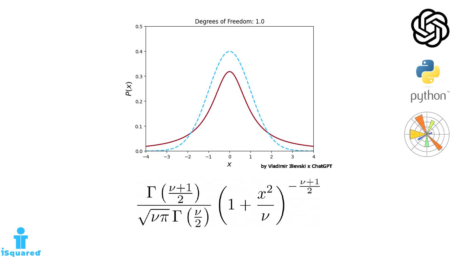
The above program creates an animation that shows how the Student’s T-distribution with different degrees of freedom \(\nu\) converge to the normal distribution (Gaussian distribution) as the degrees of freedom increase.
The FuncAnimation class is used to update the plot on each frame with a new set of data. The update() function is called on each frame, which updates the plot with the new data.
The resulting visualization is shown below:
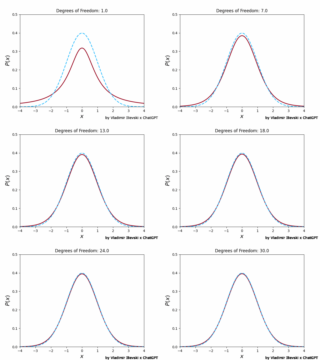
Animation: Convergence of the Student's T-distribution to normal distribution
The source code for this work can be found in this Jupyter Notebook. It would be very helpful to star the repo to get more easily noticed. For more information, please follow me on LinkedIn or Twitter.
If you like this content you can subscribe to the mailing list below to get similar updates from time to time.
Interesting fact about the Student’s T-distribution
The Student’s T-distribution is named after William Sealy Gosset, who used the pseudonym “Student” to publish his work while working at the Guinness brewery.
Gosset developed the T-distribution as a way to perform hypothesis tests when the sample size was small and the population variance was unknown. Despite the importance of his work, Gosset’s use of a pseudonym prevented him from receiving due credit for many years.
It wasn’t until several decades later that his contributions to statistical theory were widely recognized, and the T-distribution was named after him in his honor.

Leave a comment